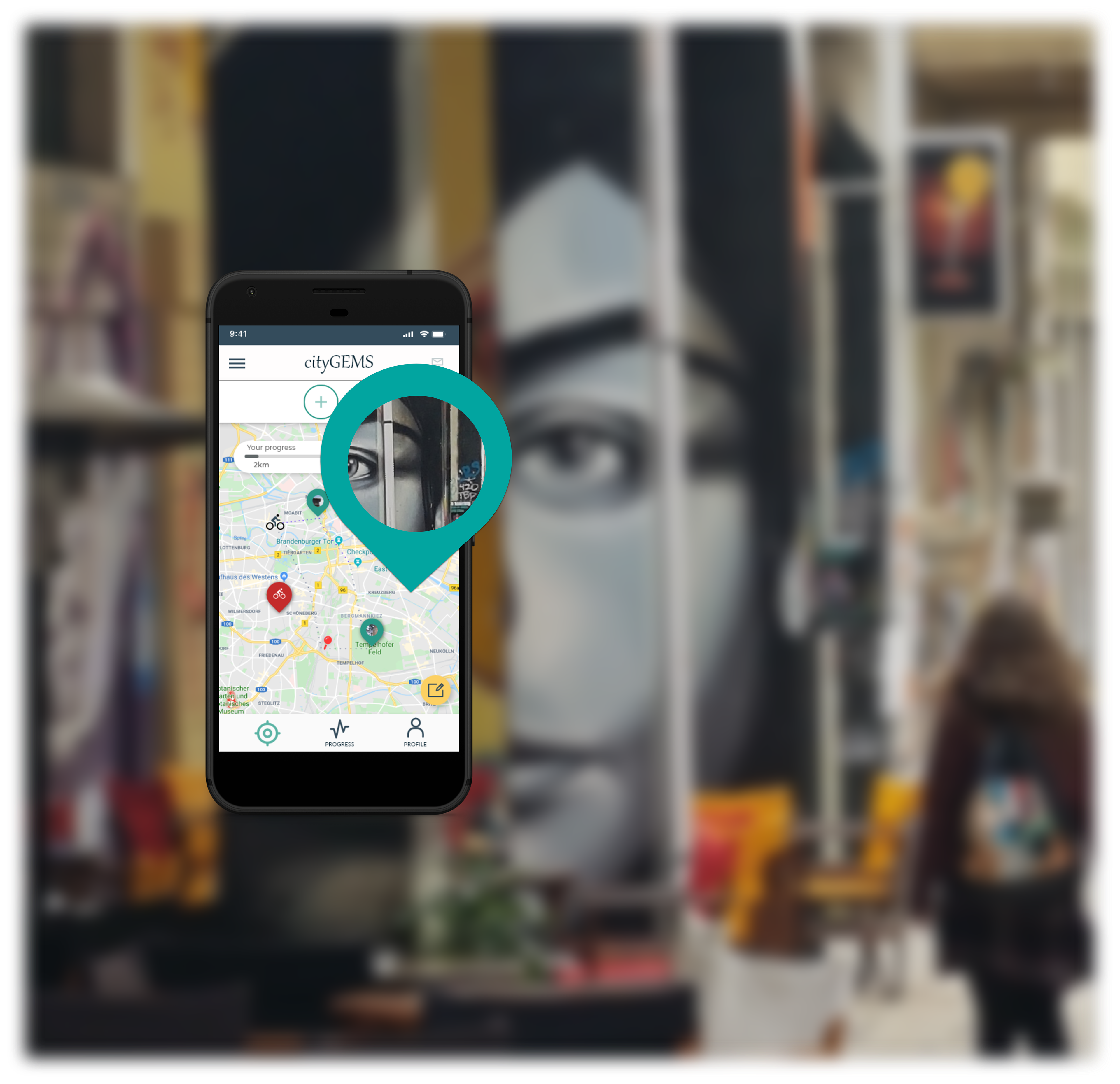
Overview
The company outlined the problem of a limited offer of applications helping users explore the real places and events in their city. I proposed a solution combining exploratory city learning and fitness tracking. Gamification of experience allows users to measure and catalogue activities while competing with others.
My role
Product Designer. I was responsible for the entire process, from strategy and research (UX) to delivering final mockups (UI). I led User Research, Usability Testing and produced a micro-copy for the application.
Target audience
- 18-40 years of age
- Living in an urban area
- Searching for new experiences & social trends
- Living in an urban area
- Searching for new experiences & social trends
This group often represents non-native inhabitants of the area. People live outside their home city because of study/work migration and being "new" to the place.
Competitors
City games like Pokemon go and scavenger hunt applications. As non-direct competitors, I consider applications allowing users to share experiences & "peek" on others like Facebook and Instagram, activity/evens or via "peeking" at the others.
Key differentiators
There is a chance to create an alternative social platform standing out from others by adding a game/competitive accent. What differentiates here is the real-life experience, not limited to time. A big part of success will be to deliver an inclusive experience and focus on the overall user experience.
Understanding The User
To understand the user, I have performed several face-to-face interviews. The in-depth analysis via Affinity Map helped me paint the picture of the two archetypes of the user. Those who are familiar with and enthusiastic about social gaming. And those who are not decided but like to keep up with social trends.
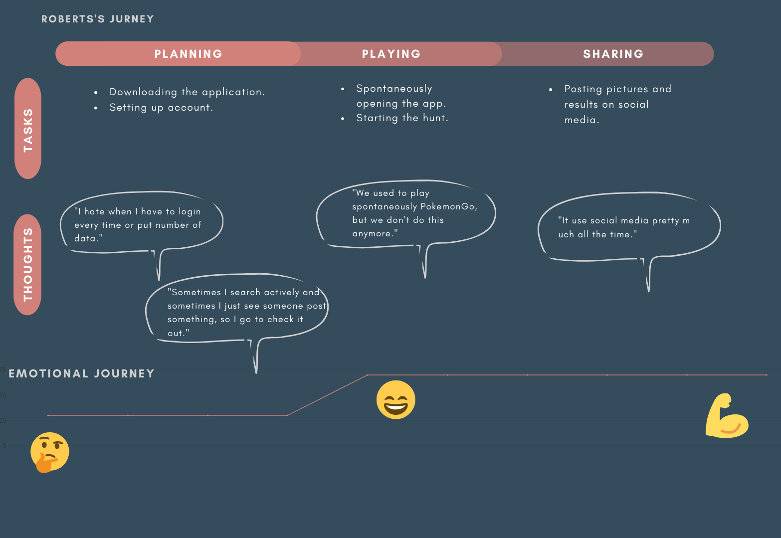
Meet Caroline & Robert
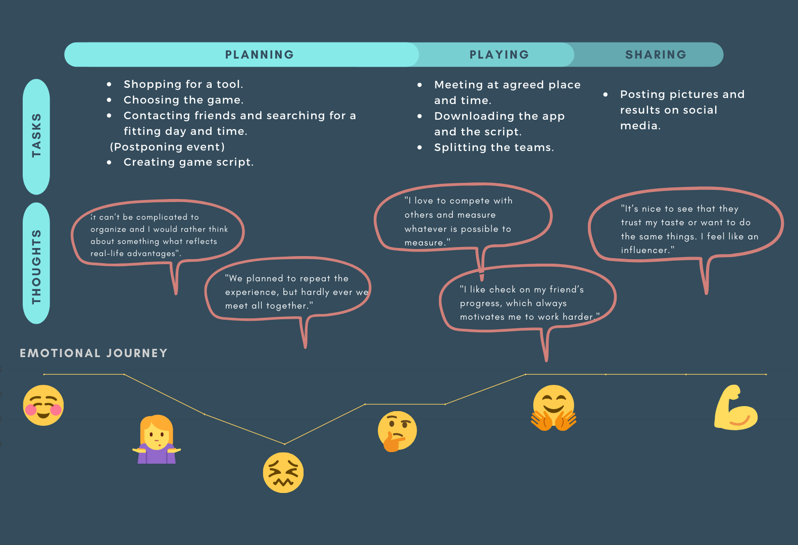
Mapping the current experience of my defined personas allowed me to determine the top-tier paths and features.
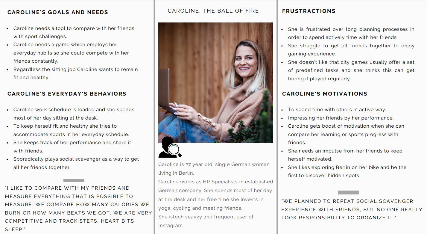
Caroline - The Ball of Fire
Caroline's work schedule is loaded, and she spends most of her day at the desk. She tries to accommodate sports in her everyday schedule to keep herself fit and healthy. She is a big fan of social gaming, although she struggles to get her friends together to enjoy the gaming experience.
Scenario
Caroline has a weekend ahead and wants to get the most of the sunny Autumn days. She wants to get her friends out.
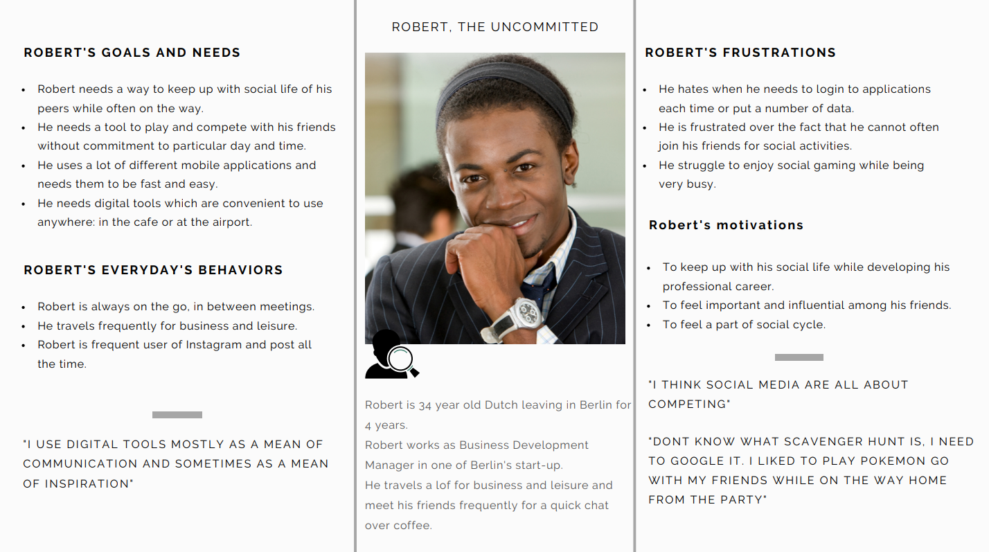
Robert - The Non-Committed
Robert is always on the go in between meetings. He travels for business. Robert is a frequent user of Instagram and posts all the time. He struggles to keep up with his social life and trends while developing his professional career.
Scenario
Robert has two weeks without any travel on his calendar, and he wants to get on track with his friends and check out the latest happenings in the city.
Conceptualisation
After analyzing users' journeys and their different approaches and needs, I determined opportunities and critical features to include. Both user archetypes show the same motivations, regardless of different lifestyle-based needs. Competition & keeping up with social trends were equally important, and the main pain points were prolonged planning and difficulties in getting together.
Opportunities
Features
+ Shortened planning process to ensure users can use the application effortlessly on a daily basis.
+ Activate fitness tracking to replace other applications.
+ Enable group, small group or solo performance to let users stay independent while still connected.
+ Enable users to start immediately or plan for the future.
+ One-time setup, no need to arrange.
+ Easy access from the lock screen to save time.
+ Enable users to incorporate the application into their daily activities to achieve the habit-forming result.
+ Interactive Map with GPS
+ Integrate fitness tracker
+ Friends performance feed
+ Live updates
+ Navigation and estimates
+ Social area
+ Integrate fitness tracker
+ Friends performance feed
+ Live updates
+ Navigation and estimates
+ Social area
Crafting The Story
Outlining different user flows helped me clearly understand how users would explore the application. On this base, I could start building up an information architecture structure by putting together the first draft of the sitemap, sketches & wireframes.
Sketching
Paper unlocks creativity and hides the whole world in its structure. And it’s forgiving, allows for drafting various scenarios for the screens, and outlines the main plots quickly.
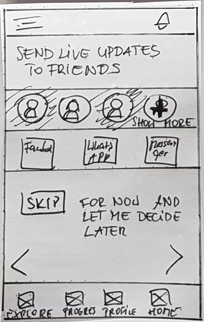
Flow 1: Exploring the city planning process
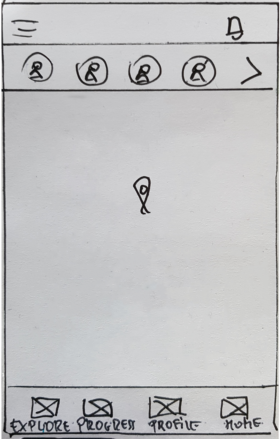
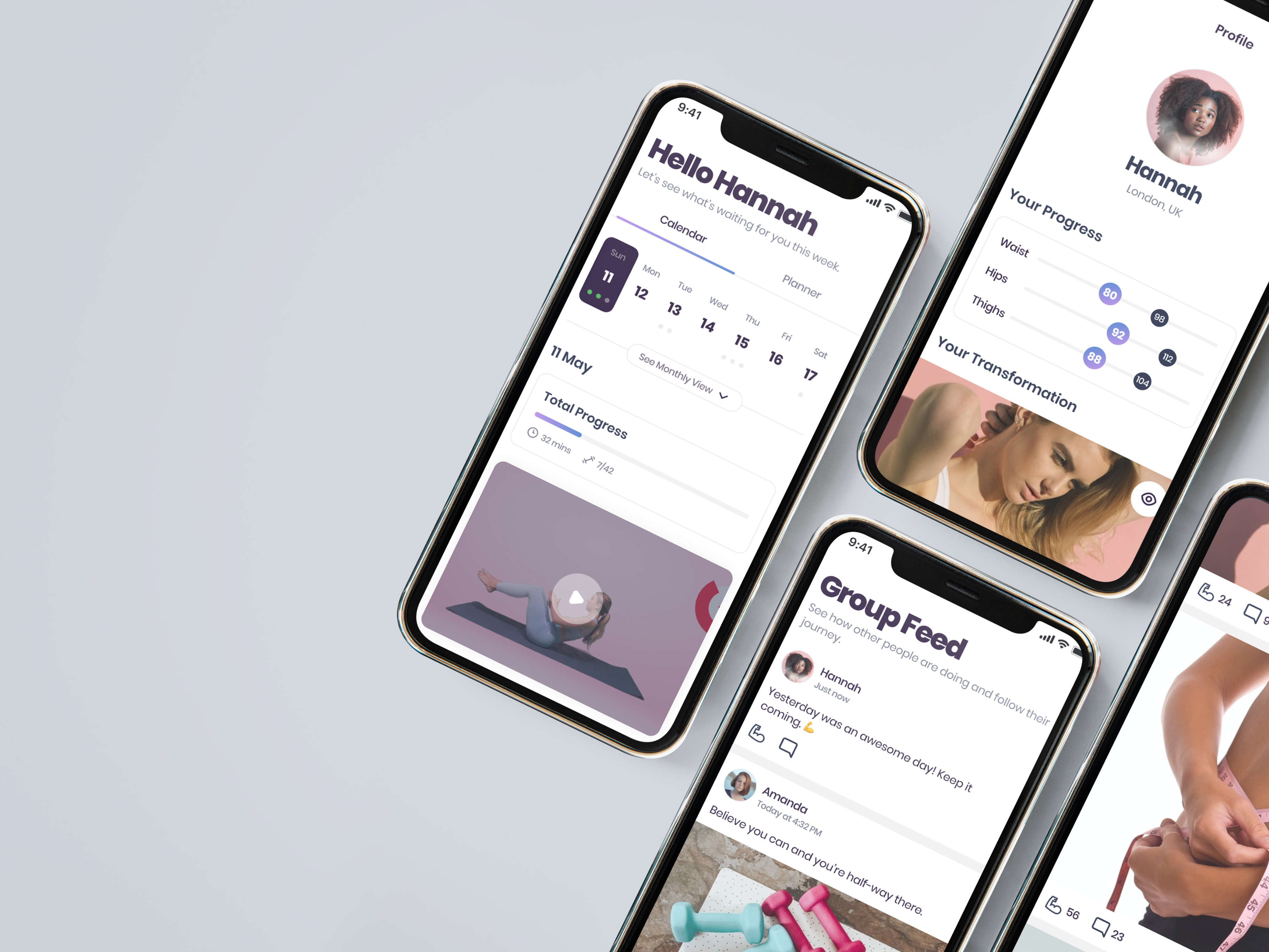
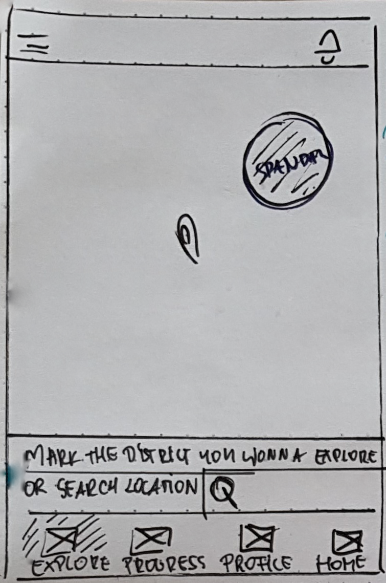
HOME SCREEN
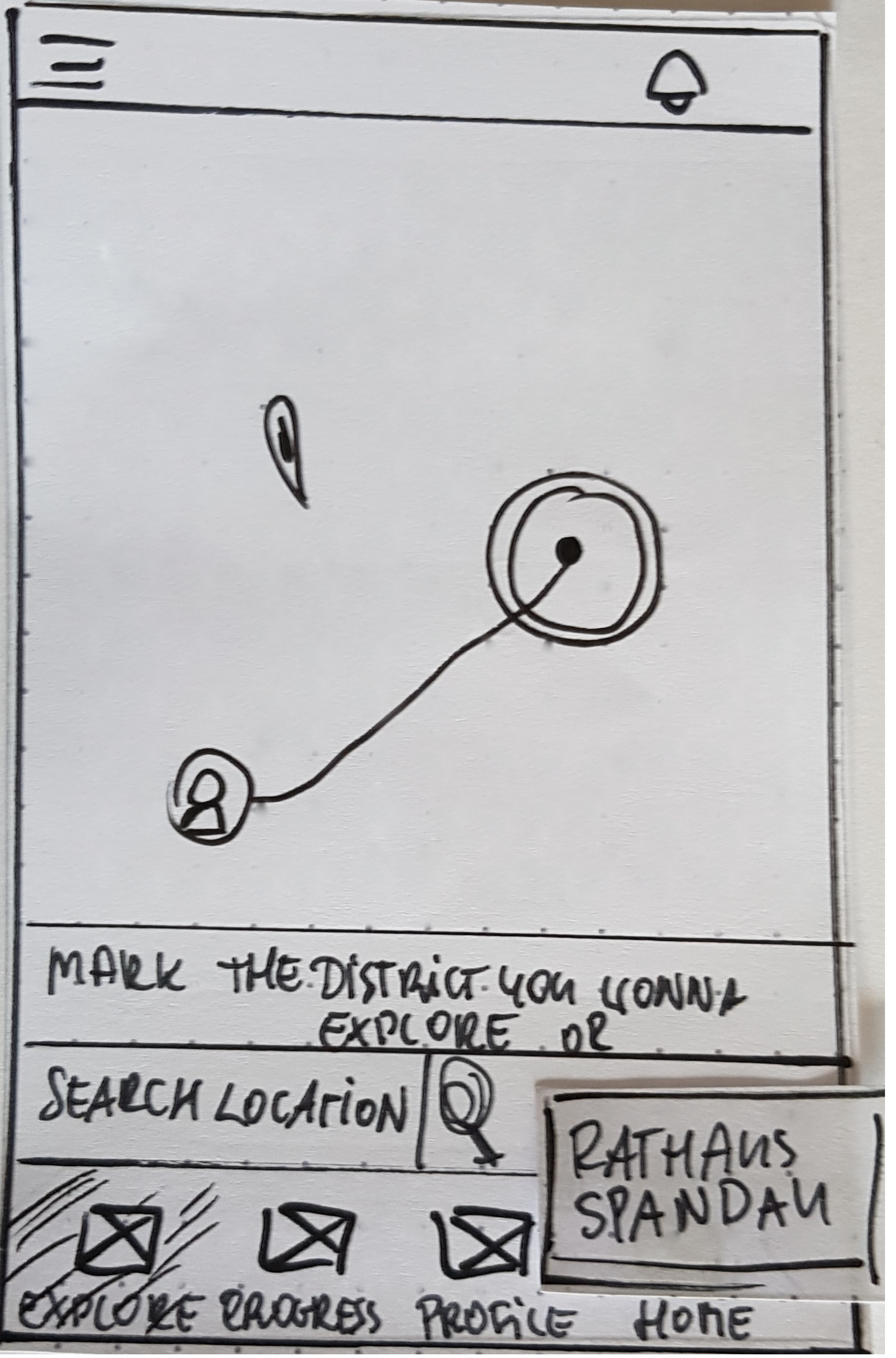
MAP/SEARCH SCREEN

CHOICE SCREEN

ESTIMATES SCREEN
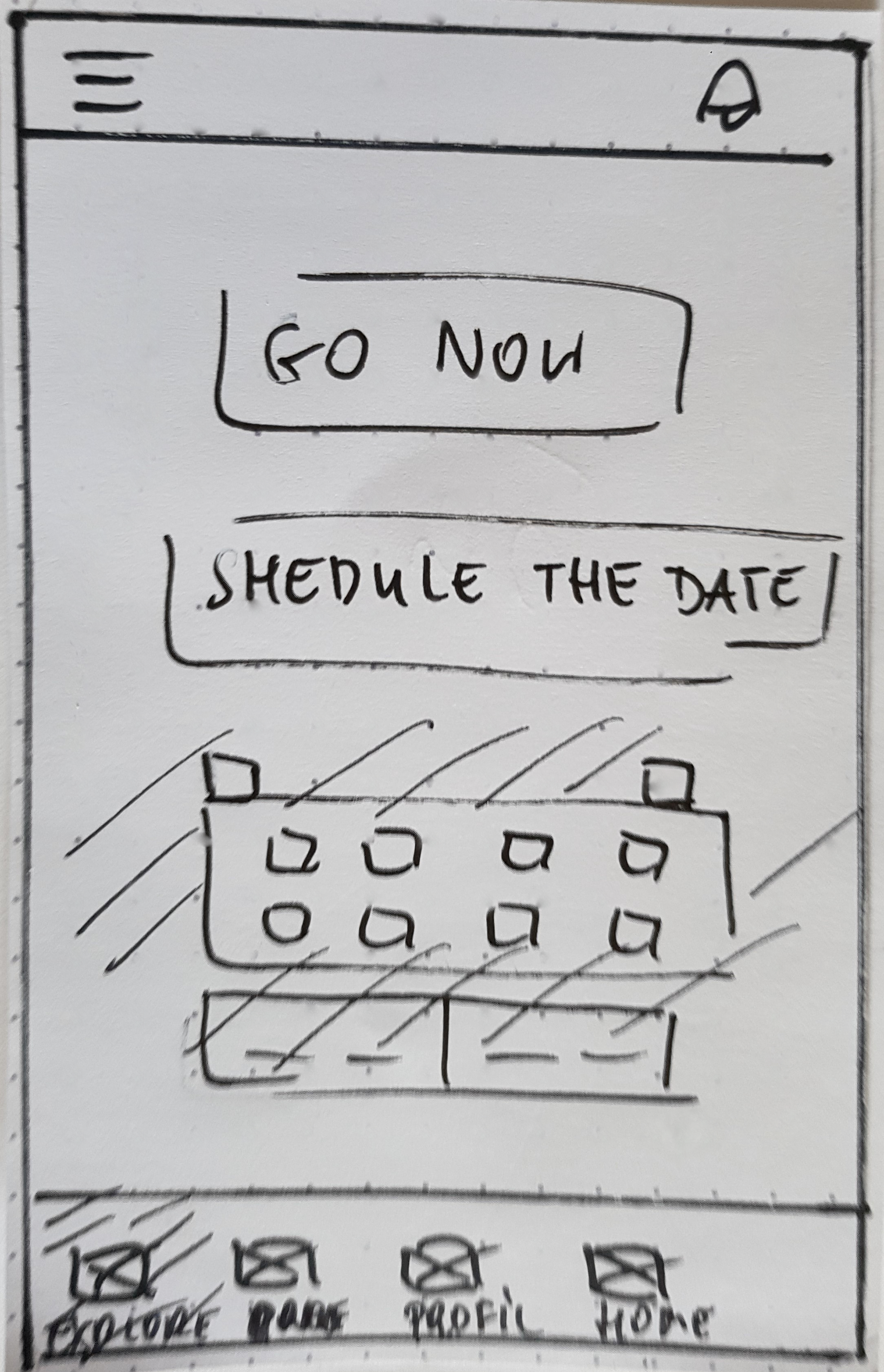
START SCREEN
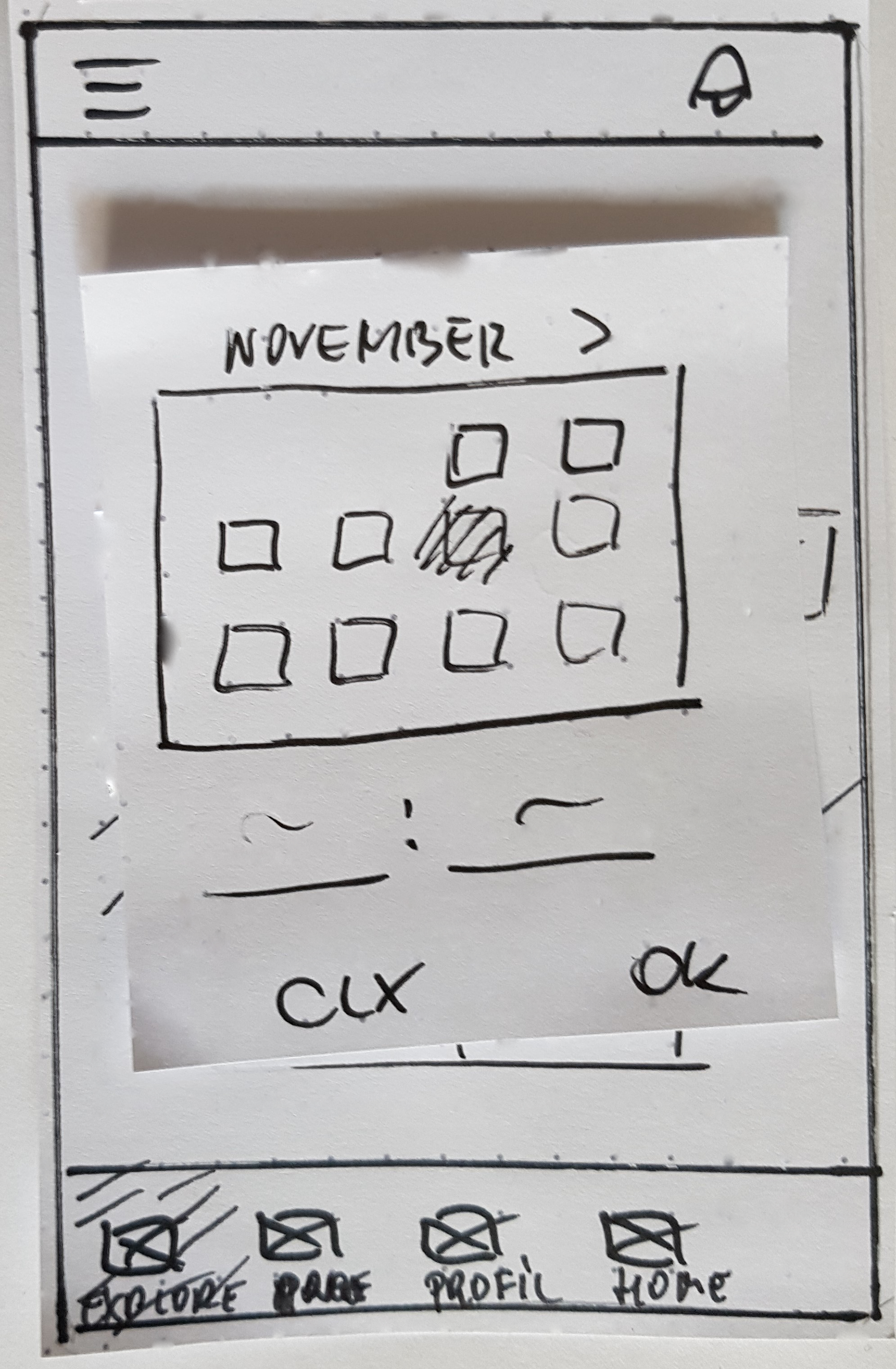
CALENDAR
Flow 2: Checking the progress & spontaneous city exploration

HOME SCREEN
PROGRESS SCREEN
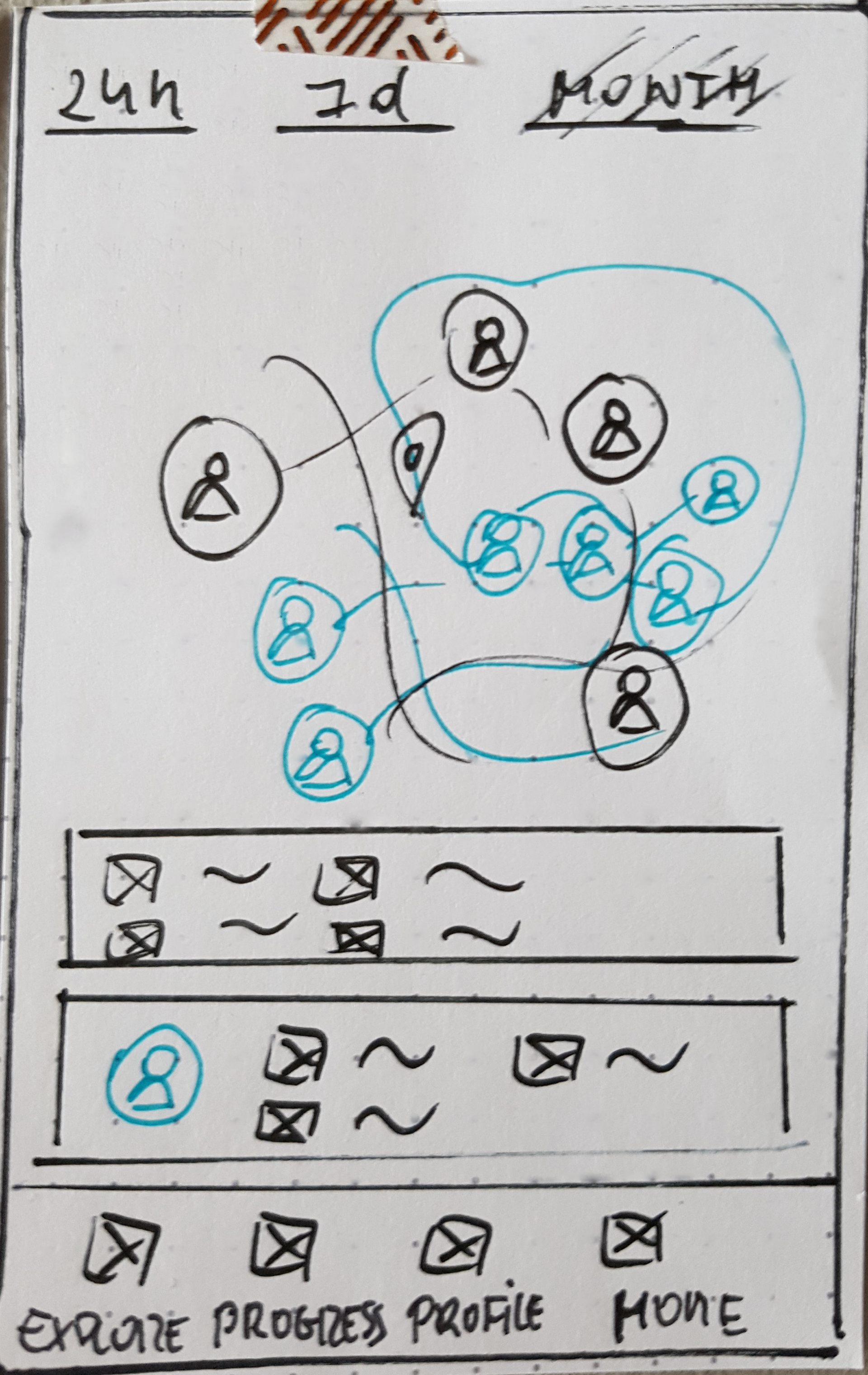
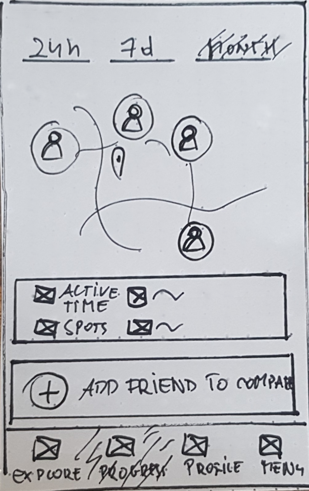
PROGRESS COMPARISON
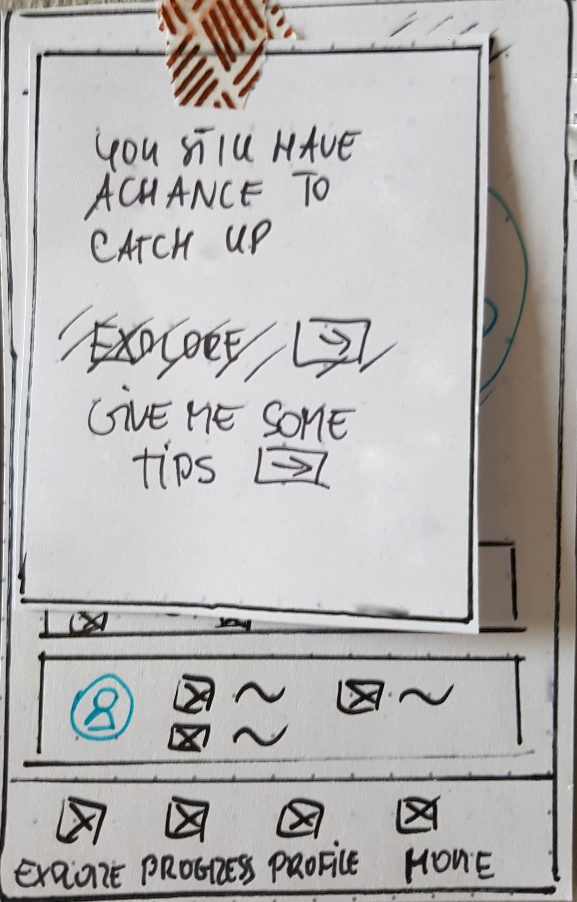
ACTION POP-UP
MAP/SEARCH SCREEN
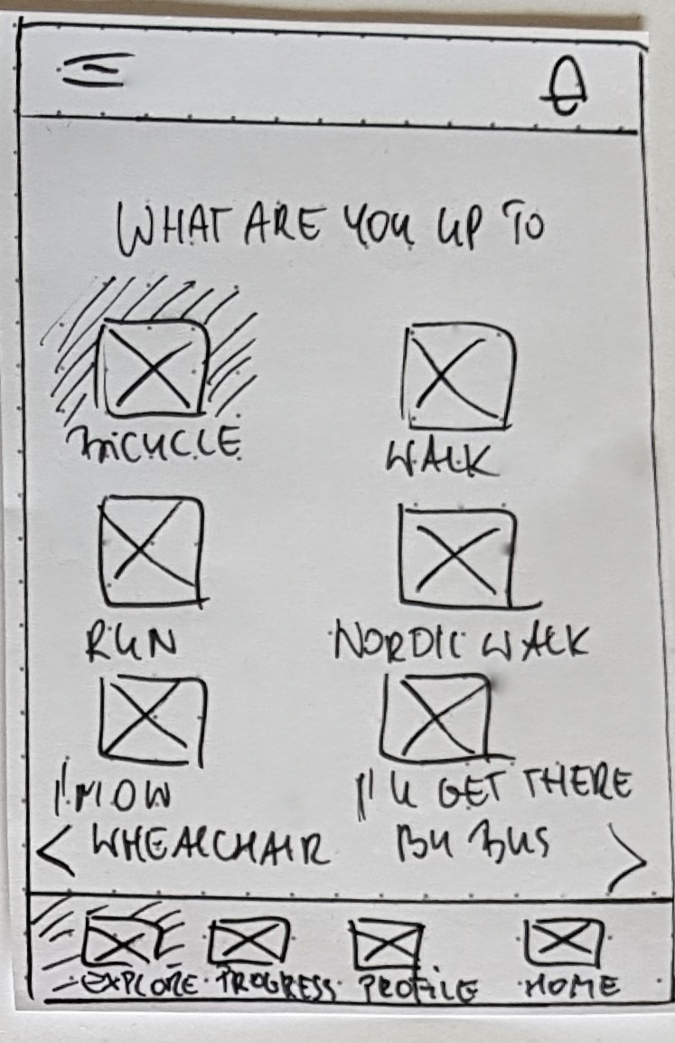
CHOICE SCREEN
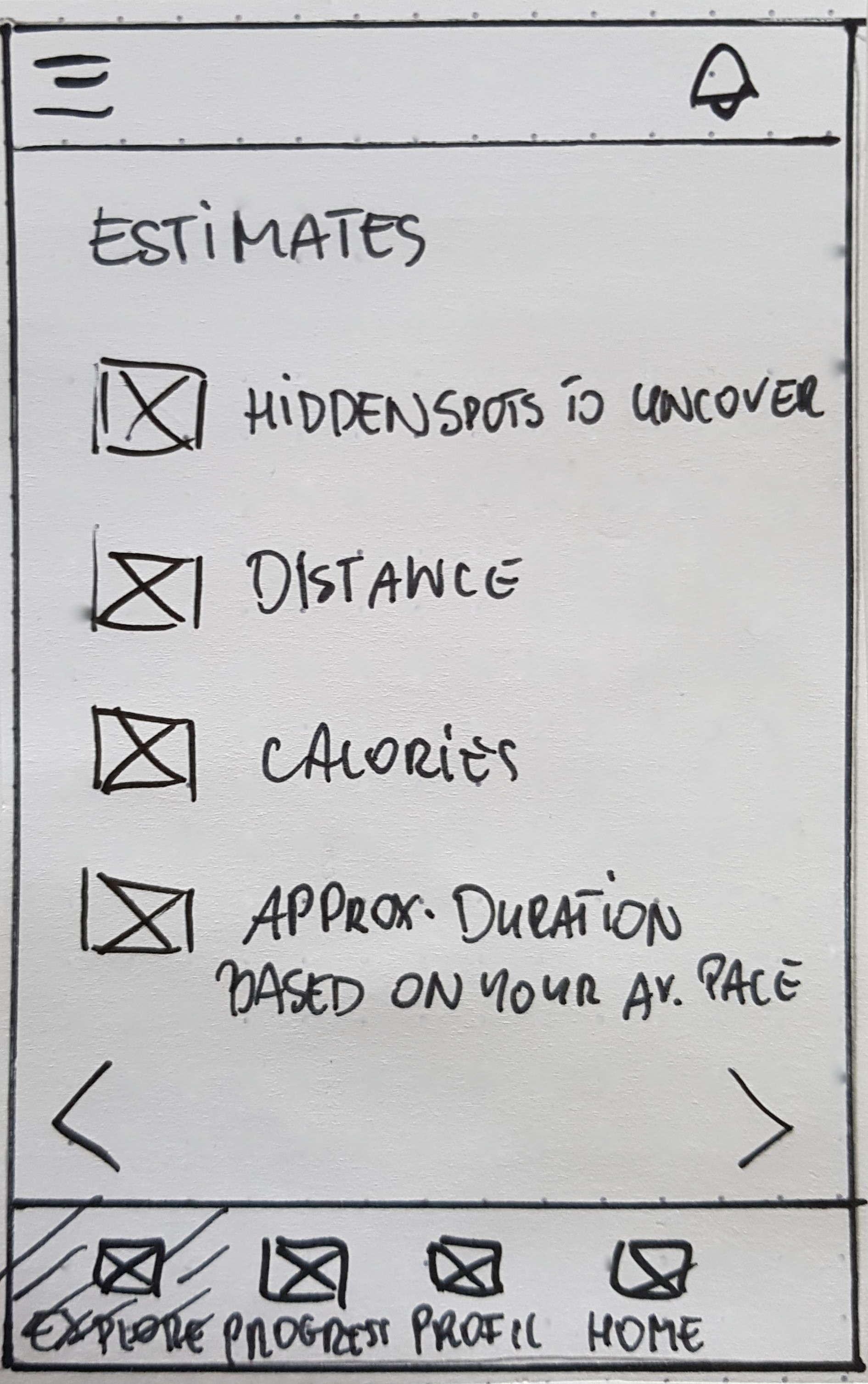
ESTIMATES SCREEN
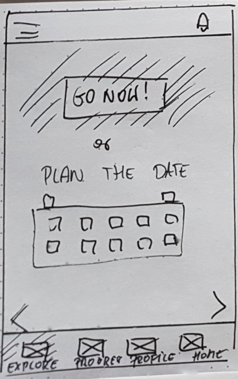
START SCREEN
SHARE SCREEN
Testing
I translated sketches into digital wireframes for a clearer picture. This allowed me to build an interactive prototype to be given to the hands of the users for testing.
I performed usability testing to check the design against users' needs. To give my full attention to the participants, I drafted a detailed plan and a script.
My choice was moderate in-person testing. The testing sessions aimed to assess first-time users' learnability and satisfaction. I wanted to determine whether the user understood the primary purpose and value of the application and how quickly and effortlessly they would complete the tasks.
Refining The Design
When shaping the experience, I went for the intelligible interface. Avoid cognitive overload by mirroring well-known patterns and understandable hierarchy.
Immersing in the colourful world of emotions
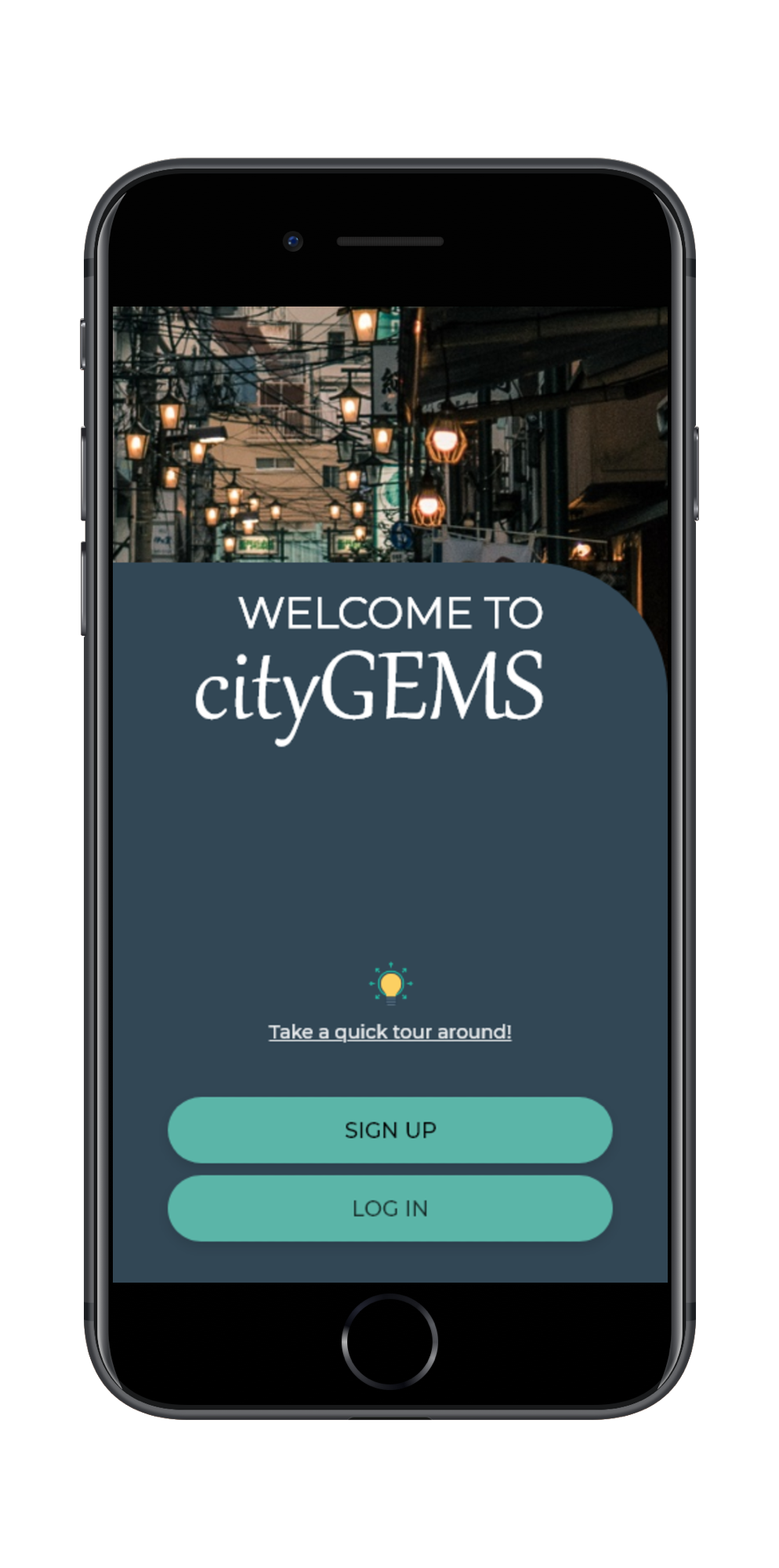
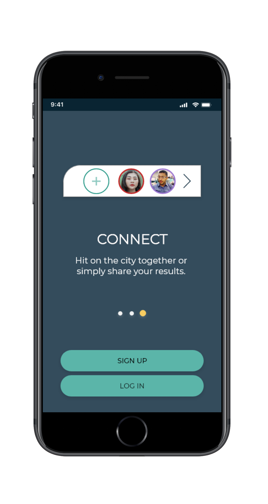
WELCOME SCREEN
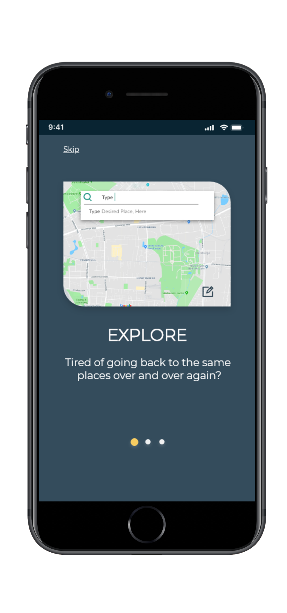
ONBOARDING 1/3
1. Curiosity & Fun
Uncovering a "bit more" by using round corners is intended to excite users' curiosity. It's the primary purpose of the game. Finding the unknown, what is hidden from us, exploring. I have added yellow elements. Yellow is a friendly colour, a colour of fun.
2. Respecting differences
The Experimental Learning Theory puts the experience at the centre of adults' learning. Progressive learning addresses the needs of users who want more guidance.
ONBOARDING /3
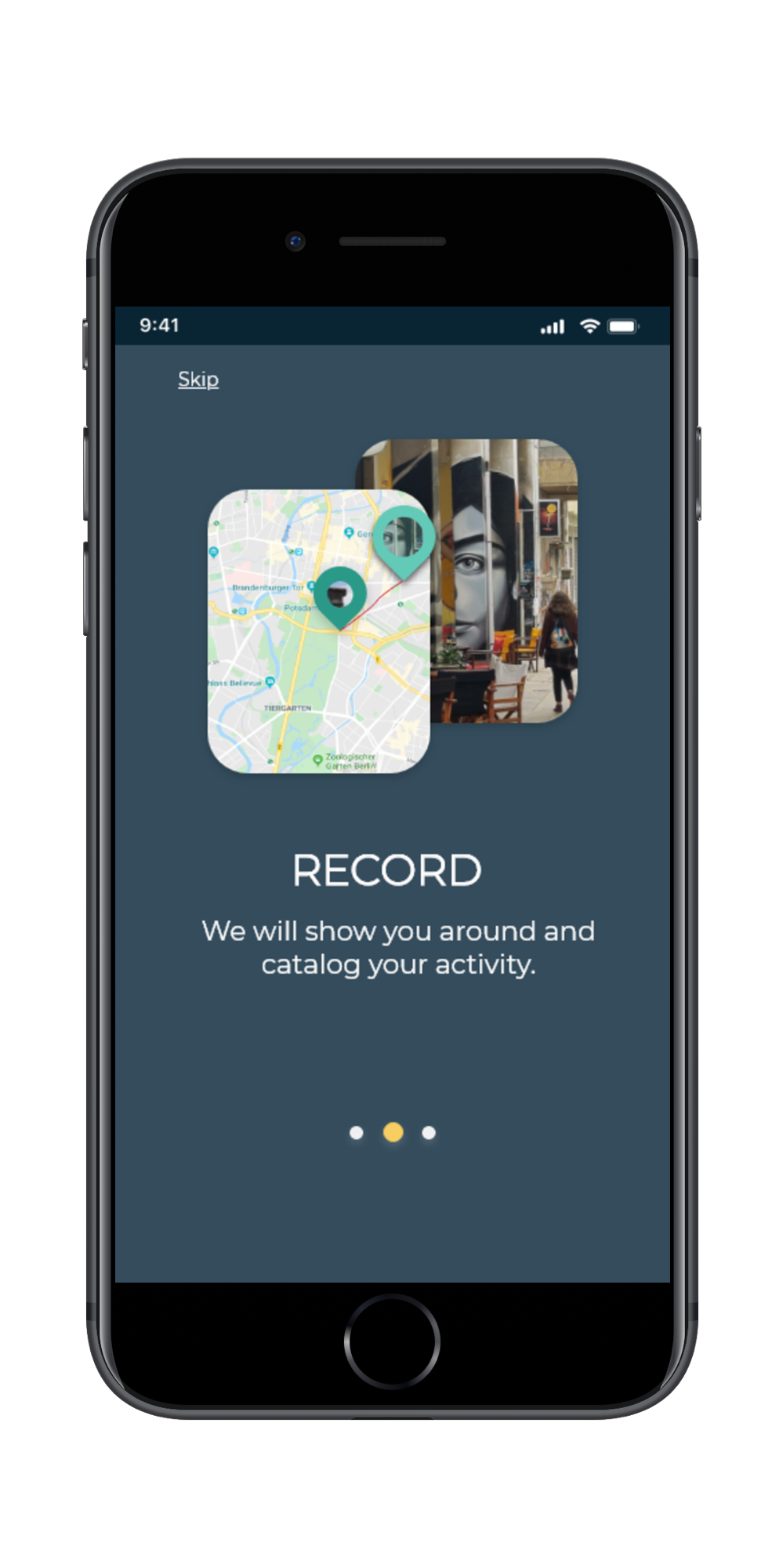
ONBOARDING 3/3
3. Bold & confident
The primary colour of the application is dark blue. Blue is often associated with confidence. Isn’t this what we want to feel looking at the tool we are giving our health and well-being.
4. Vitalize
I added green to the dark background as the secondary colour associated with nature and health.
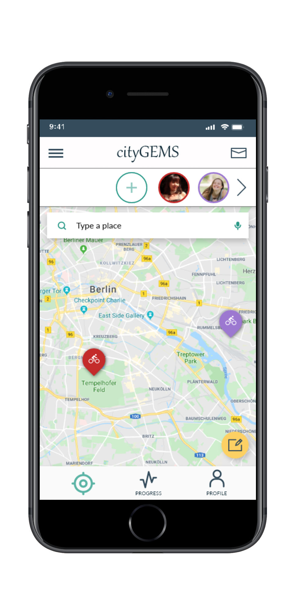
HOME/EXPLORE SCREEN
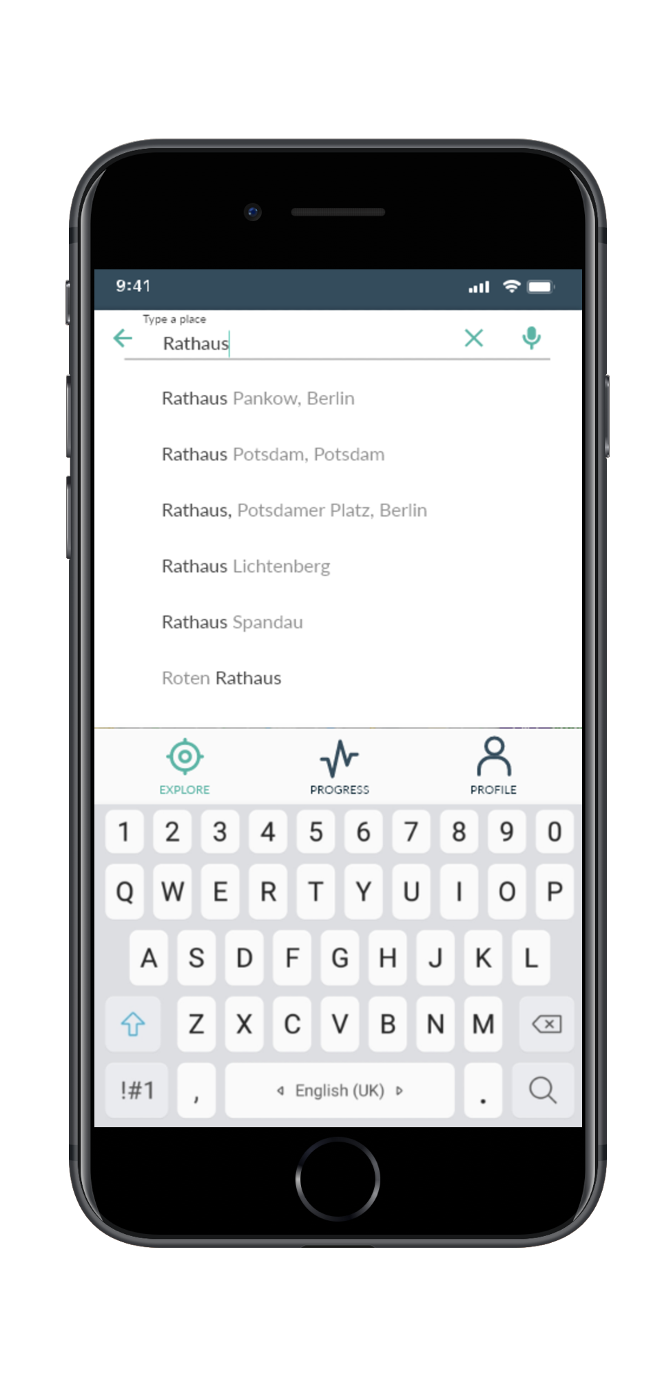
SERACH RESULTS
5. Togetherness
What brings experience to life beyond the moment is when we can share it with friends and close ones.
6. Inclusivity
A clean interface, broad components, readable typography, high contrast and well-known patterns are intended to address the needs of people with different body & cognitive abilities.
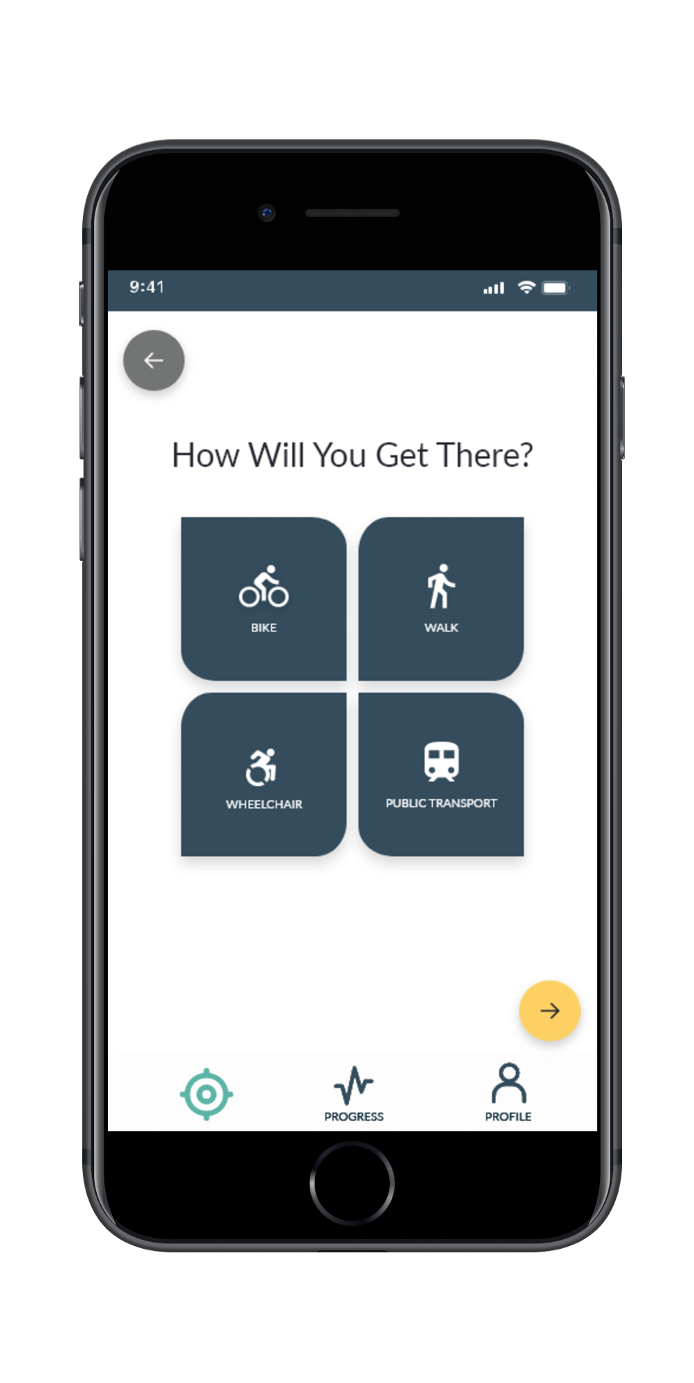
CHOICE SCREEN
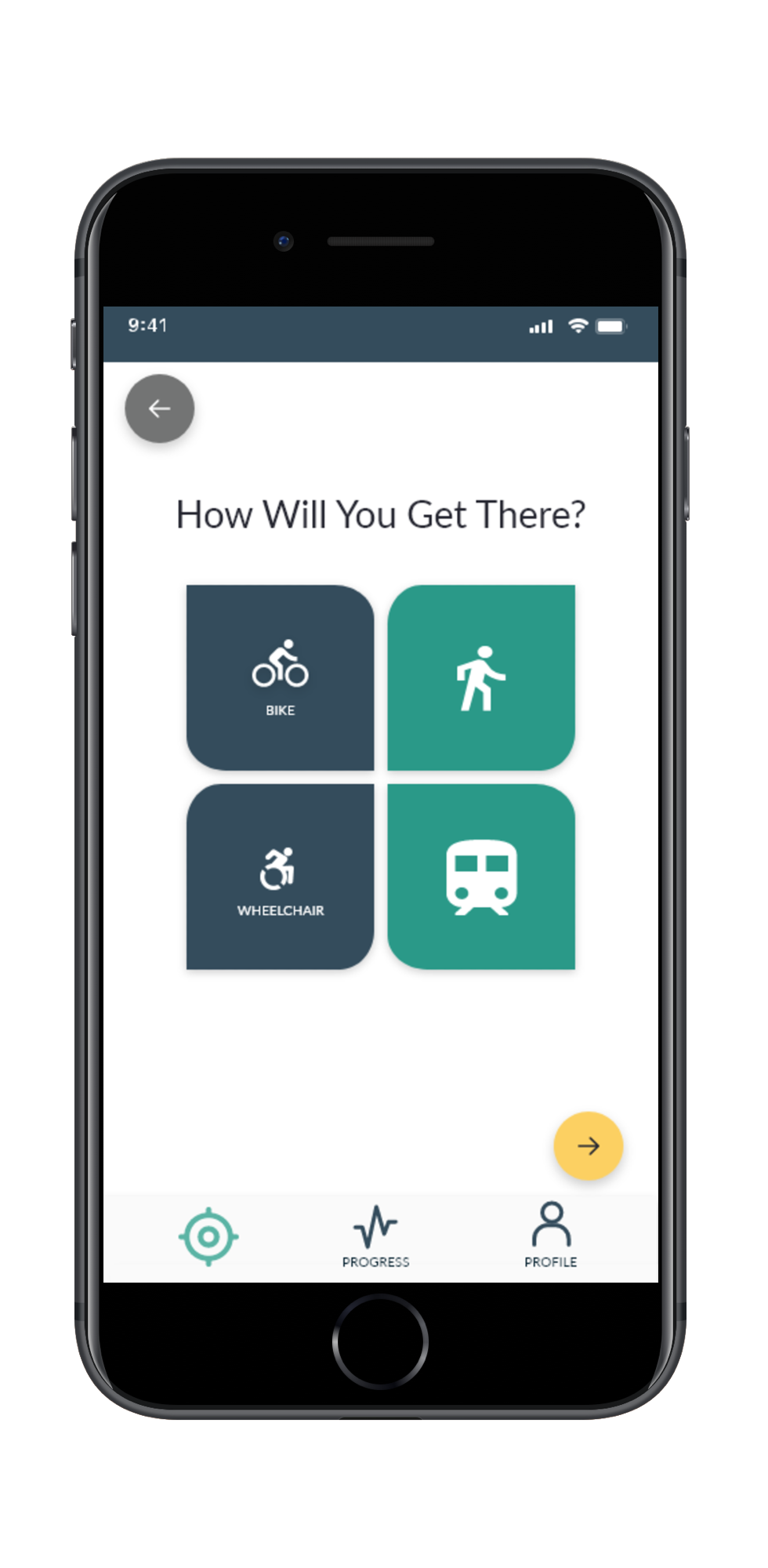
CHOICE SCREEN ACTIVE CHOICE
7. Enabling focus & sense of control
I have removed upper navigation on the deeper levels of the application. Mobile devices used in various environmental contexts require a different concentration level to accomplish tasks. This allowed me to move a dynamic search function to the upper part of the screen to get space real estate for search results.
I opt for persistent navigation to help users understand where they are and quickly move around the options.
Designing For Accessibility
I have applied the Microsoft Inclusive Design Principles and Persona Spectrum concept to design each piece of experience. I situated my personas in a range of situational & behavioural contexts to look beyond personal experiences.
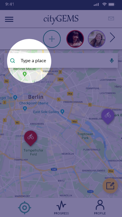
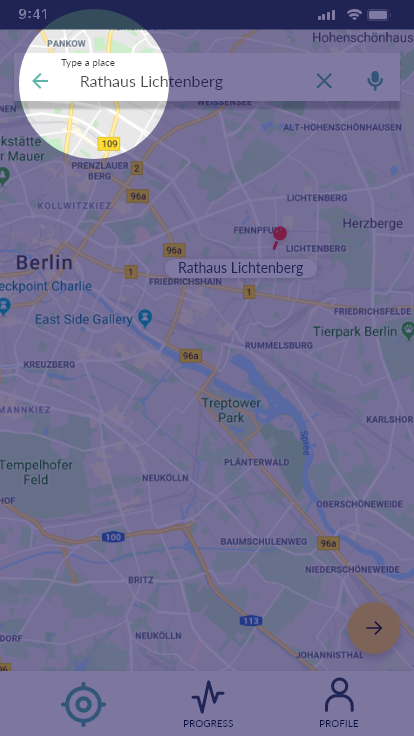
High-contrast persistent label inside the floating search field visible throughout the process.
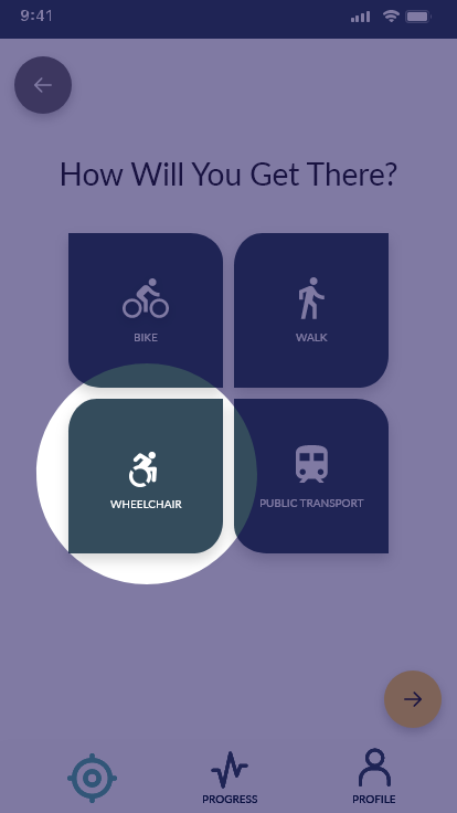
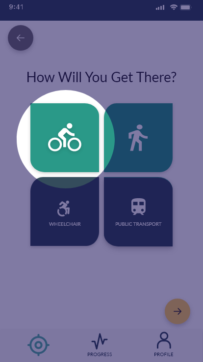
For better recognition of active elements, there is a change in the colour and size of the icon as well as a lack of labels. Users can choose two different ways of transportation, e.g. get to the destination by public transport and then walk or use a bicycle. This allows another user who is not fit for long distances activities to explore the city and become part of the experience.
While choosing a Wheelchair, the application will track "pushes" instead of "steps".
Image credit: Katarzyna Niewczas & Canva
Feel free to reach out to me at katarzyna.niewczas.ux@gmail.com